Thursday, 10 October 2013

Final Magazine Proposal


This is my final magazine proposal where i have included my ideas for my magazine, i have also included a character profile- this profile is a person that i think would buy my magazine. 


Thursday, 3 October 2013

Feedback for my magazine

This is my feedback video where i have asked my target audience about my magazine. It would help me with the planning for my magazine as by getting the audience's opinion I can learn and develop ideas for it. For example i asked about the price of my magazine and if it was reasonable or not- they replied that it was, so therefore i should leave the price as it is.

Tuesday, 1 October 2013

Monday, 30 September 2013

Questionnaire Results

These are the questionnaire results taken from survey monkey, where i asked multiple questions targeted at my audience, in order to develop an understanding on what my audience sees as a suitable magazine they would buy. 


In this question, I asked ‘what is your favourite music genre’ and the most answered was ‘R & B’ and ‘indie’, which then tells me that out of all of these genres, these two was everyone’s favourite therefore giving me two choices for the genre of my magazine.


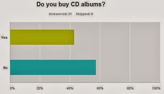
In this question, I asked ‘do you buy CD albums’ and ‘no’ was the most answered therefore telling me that I shouldn’t include a lot of album reviews.


In this question, I asked ‘do you follow any music celebrities on social networks’ and ‘yes’ was the most answered therefore telling me that I should advertise and include celebrities’ social networks in my magazine. 


In this question, I asked ‘how do you normally discover new music’, and ‘internet’ was the most answered, which then tells me that I should have an online magazine, so that people can be kept updated with new music through my magazine.


In this question, I asked ‘do you like reading articles/interviews about your favourite artist/band’ and ‘yes’ was the most answered telling me that I should include interviews and articles about artists/bands.


In this question, I asked ‘how many festivals/concerts have you attended in the past’ and the ‘1-5’ was the most answered which then tells me that I should keep the audience updated on any new festivals/concerts that are happening. 


In this question, I asked ‘what do you find to be the main factor in deciding whether you like an artist/band or not’ and ‘lyric style/rhythm’ was the most answered therefore giving me an advantage in advertising the artist/band as I would include a quote from their song to attract the audience. 


In this question, I asked ‘how many hours do you spend listening to music per day’ and ‘5+’ was the most answered which then tells me that I should include a playlist on my online magazine so that they can listen to music while browsing. 


In this question, I asked ‘if you saw a magazine in the shop, what would convince you to buy it’ and the ‘central image’ was the most answered this then tells me that I should focus on the central image and make sure it is eye catching to attract  the audience. 


In this question, ‘I asked how much would you be willing to pay for a monthly magazine’ and ‘£2-£2.50’ which then tells me what price I should sell my magazine at. 

Saturday, 28 September 2013

Institutional research

This is institutional research, showing four different media companies, and explaining the types of magazines they produce, and their target audience. 


Tuesday, 24 September 2013

Analysing double page spread

This is an analysis of Q's double page article, including the mise-en-scene and conventions.


The choice of band featured in the article suggests that the target audience would be both genders over 25 years old as the band The Kings of Leon’s music genre is rock so therefore appealing to both genders, also due to being around for so long they have developed a big fan base.

The type of language that is used in the article would be formal, it is written in a narrative way so a person is telling their story, with some quotes here and there from the band. ‘The kings of Leon singer flew into Nashville from New York yesterday’- by having a story told from third person’s point of view gives an advantage for the article as it will give the whole story for each of the band member, instead of from just one member. It will also engage more readers as they would find it more interesting to read. It also has some funny quotes to keep the story interesting and humorous so the readers are entertained- ‘it means you’ve been smoking weed before bed again’.

The colour scheme is the same as the cover page and contents which shows there is a house style. The colour black is used for the main text and the red is used for the little information on the side or a caption for a photo, and the white is the background. The colours make it very clear and easy to read as it contrasts well with each other. The text is also the same on the front cover; the bold fonts are used in both, which makes it eye catching.
The style of text is quite small like a newspaper print; for the article but it is very clear to read. For the quotes, the text is big and bold to attract readers, as they would automatically see the quote which is featured in the article, therefore wanting to read more.

The double page spread is laid out in a very simple way with the text placed out in two columns and a large image on the right hand side as well as a little image on the bottom left hand corner which relates to the article. There are captions for each picture which explains who is who and any other information. The amount of text and images are quite even, which makes it look balanced out so that readers can get the best of both.

The sort of tone that the magazine is using when addressing the reader is an informed intelligent fan, as the person who wrote this article it telling the audience what has been happening behind the scenes of the band’s life and what they have been doing while on hiatus. The tone could also be as a close friend as a lot of facts and secrets are revealed in the article as well as a lot private things that are only kept within the band are discovered therefore the tone would be a close friend as you would only reveal these type of things to a close friend.

Through the images the band is being represented as a very close and intimate band, which is shown through the image as there are all close to each other with their arms around one another. They look very calm and relaxed which shows how friendly there are with one another, which then shows that they must be nice guys to hang around with. Also because they are family, there bond is really reflected in this photo.


The article does not demand ant prior knowledge when reading the article, as it goes straight into talking about the band, and readers would understand it automatically. ‘The Kings of Leon singer’- this therefore identifies who they are talking about so that the readers who don’t know would now know they are talking about the singer of the band. It also gives background information about the band members that readers may or may not have already known for example ‘his wife, the model Lily Aldridge, and one-year-old baby Dixie Pearl’- this then makes it more interesting to read if there is more background information involved as it makes readers want to know more. ‘Back in November 2011, when the needle hit the red and Kings of Leon announced they would be going on a hiatus for six months’- This gives the specific date and what happened, therefore informing readers who didn’t know.  

Monday, 23 September 2013

Analysing contents page

This is an analysis of Q's contents page, including the mise-en-scene and conventions. 


The magazine has used images for the main articles, so kings of Leon have the biggest image which is at the top of the contents page; it is also near the heading which symbolises the importance of the article. The main articles that were featured on the front cover are at the top of the magazine with the cover story, so that readers will find it easier to locate their specific read. The images are beside the title and page number of the specific article, so readers can distinguish the different articles. The images support my initial findings about the style of the magazine as it shows different artists which show variety, which would then attract the intended audience- who are music buyers over 25 years old, both genders as there are a lot group bands e.g. the sugababes and the kings of Leon which both appeal to the male and female audience.
The colours that are used are mostly red, white and black, the fonts are clear and bold, and this shows that the magazine has a house style due to the same colours and fonts used on the front cover; these colours would also then appeal to the target audience as red, white and black are colours mutual for both genders. The contents includes the page number on the top of each article title then after it is a little summary of what is included in the article so readers would know what exactly is in it, some also include quotes from the article which then makes it eye catching as readers would want to know what is in the article. On the right hand side of the contents it is titled ‘Q review’ where they have reviewed new albums, reissues, live gigs and films. This then gives the audience a clear and direct view on where to go if they want to read a specific article, it is also very informative as it keeps the readers up to date, so they know what has been happening in the music industry. It also says ‘The world’s finest music guide’- which then makes it eye catching as it says the ‘world’s finest’ which then makes it very impressive for the magazine because it is the greatest music guide in the world. The layout of the contents page appeal to the audience, as it is set out in columns and the background colour is contrasting with the text; this then makes it simple and easy to read. The pictures do not overlap any text which makes it very distinctive to read, and readers can associate what pictures go with what article.
On the left hand side of the page is an advertisement that links to the main article; it is an ad for the new album for ‘Kings of Leon’- this then shows that because of their worldwide comeback that they needed to have them on a double page contents spread.
The magazine logo is placed on the top left hand corner; it is quite dominant as it stands out this then shows readers that it is a famous and well-known magazine as it has such a big logo.