Monday 30 September 2013

Questionnaire Results

These are the questionnaire results taken from survey monkey, where i asked multiple questions targeted at my audience, in order to develop an understanding on what my audience sees as a suitable magazine they would buy. 


In this question, I asked ‘what is your favourite music genre’ and the most answered was ‘R & B’ and ‘indie’, which then tells me that out of all of these genres, these two was everyone’s favourite therefore giving me two choices for the genre of my magazine.


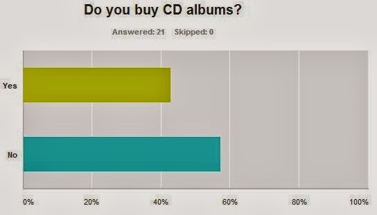
In this question, I asked ‘do you buy CD albums’ and ‘no’ was the most answered therefore telling me that I shouldn’t include a lot of album reviews.


In this question, I asked ‘do you follow any music celebrities on social networks’ and ‘yes’ was the most answered therefore telling me that I should advertise and include celebrities’ social networks in my magazine. 


In this question, I asked ‘how do you normally discover new music’, and ‘internet’ was the most answered, which then tells me that I should have an online magazine, so that people can be kept updated with new music through my magazine.


In this question, I asked ‘do you like reading articles/interviews about your favourite artist/band’ and ‘yes’ was the most answered telling me that I should include interviews and articles about artists/bands.


In this question, I asked ‘how many festivals/concerts have you attended in the past’ and the ‘1-5’ was the most answered which then tells me that I should keep the audience updated on any new festivals/concerts that are happening. 


In this question, I asked ‘what do you find to be the main factor in deciding whether you like an artist/band or not’ and ‘lyric style/rhythm’ was the most answered therefore giving me an advantage in advertising the artist/band as I would include a quote from their song to attract the audience. 


In this question, I asked ‘how many hours do you spend listening to music per day’ and ‘5+’ was the most answered which then tells me that I should include a playlist on my online magazine so that they can listen to music while browsing. 


In this question, I asked ‘if you saw a magazine in the shop, what would convince you to buy it’ and the ‘central image’ was the most answered this then tells me that I should focus on the central image and make sure it is eye catching to attract  the audience. 


In this question, ‘I asked how much would you be willing to pay for a monthly magazine’ and ‘£2-£2.50’ which then tells me what price I should sell my magazine at. 

Saturday 28 September 2013

Institutional research

This is institutional research, showing four different media companies, and explaining the types of magazines they produce, and their target audience. 


Tuesday 24 September 2013

Analysing double page spread

This is an analysis of Q's double page article, including the mise-en-scene and conventions.


The choice of band featured in the article suggests that the target audience would be both genders over 25 years old as the band The Kings of Leon’s music genre is rock so therefore appealing to both genders, also due to being around for so long they have developed a big fan base.

The type of language that is used in the article would be formal, it is written in a narrative way so a person is telling their story, with some quotes here and there from the band. ‘The kings of Leon singer flew into Nashville from New York yesterday’- by having a story told from third person’s point of view gives an advantage for the article as it will give the whole story for each of the band member, instead of from just one member. It will also engage more readers as they would find it more interesting to read. It also has some funny quotes to keep the story interesting and humorous so the readers are entertained- ‘it means you’ve been smoking weed before bed again’.

The colour scheme is the same as the cover page and contents which shows there is a house style. The colour black is used for the main text and the red is used for the little information on the side or a caption for a photo, and the white is the background. The colours make it very clear and easy to read as it contrasts well with each other. The text is also the same on the front cover; the bold fonts are used in both, which makes it eye catching.
The style of text is quite small like a newspaper print; for the article but it is very clear to read. For the quotes, the text is big and bold to attract readers, as they would automatically see the quote which is featured in the article, therefore wanting to read more.

The double page spread is laid out in a very simple way with the text placed out in two columns and a large image on the right hand side as well as a little image on the bottom left hand corner which relates to the article. There are captions for each picture which explains who is who and any other information. The amount of text and images are quite even, which makes it look balanced out so that readers can get the best of both.

The sort of tone that the magazine is using when addressing the reader is an informed intelligent fan, as the person who wrote this article it telling the audience what has been happening behind the scenes of the band’s life and what they have been doing while on hiatus. The tone could also be as a close friend as a lot of facts and secrets are revealed in the article as well as a lot private things that are only kept within the band are discovered therefore the tone would be a close friend as you would only reveal these type of things to a close friend.

Through the images the band is being represented as a very close and intimate band, which is shown through the image as there are all close to each other with their arms around one another. They look very calm and relaxed which shows how friendly there are with one another, which then shows that they must be nice guys to hang around with. Also because they are family, there bond is really reflected in this photo.


The article does not demand ant prior knowledge when reading the article, as it goes straight into talking about the band, and readers would understand it automatically. ‘The Kings of Leon singer’- this therefore identifies who they are talking about so that the readers who don’t know would now know they are talking about the singer of the band. It also gives background information about the band members that readers may or may not have already known for example ‘his wife, the model Lily Aldridge, and one-year-old baby Dixie Pearl’- this then makes it more interesting to read if there is more background information involved as it makes readers want to know more. ‘Back in November 2011, when the needle hit the red and Kings of Leon announced they would be going on a hiatus for six months’- This gives the specific date and what happened, therefore informing readers who didn’t know.  

Monday 23 September 2013

Analysing contents page

This is an analysis of Q's contents page, including the mise-en-scene and conventions. 


The magazine has used images for the main articles, so kings of Leon have the biggest image which is at the top of the contents page; it is also near the heading which symbolises the importance of the article. The main articles that were featured on the front cover are at the top of the magazine with the cover story, so that readers will find it easier to locate their specific read. The images are beside the title and page number of the specific article, so readers can distinguish the different articles. The images support my initial findings about the style of the magazine as it shows different artists which show variety, which would then attract the intended audience- who are music buyers over 25 years old, both genders as there are a lot group bands e.g. the sugababes and the kings of Leon which both appeal to the male and female audience.
The colours that are used are mostly red, white and black, the fonts are clear and bold, and this shows that the magazine has a house style due to the same colours and fonts used on the front cover; these colours would also then appeal to the target audience as red, white and black are colours mutual for both genders. The contents includes the page number on the top of each article title then after it is a little summary of what is included in the article so readers would know what exactly is in it, some also include quotes from the article which then makes it eye catching as readers would want to know what is in the article. On the right hand side of the contents it is titled ‘Q review’ where they have reviewed new albums, reissues, live gigs and films. This then gives the audience a clear and direct view on where to go if they want to read a specific article, it is also very informative as it keeps the readers up to date, so they know what has been happening in the music industry. It also says ‘The world’s finest music guide’- which then makes it eye catching as it says the ‘world’s finest’ which then makes it very impressive for the magazine because it is the greatest music guide in the world. The layout of the contents page appeal to the audience, as it is set out in columns and the background colour is contrasting with the text; this then makes it simple and easy to read. The pictures do not overlap any text which makes it very distinctive to read, and readers can associate what pictures go with what article.
On the left hand side of the page is an advertisement that links to the main article; it is an ad for the new album for ‘Kings of Leon’- this then shows that because of their worldwide comeback that they needed to have them on a double page contents spread.
The magazine logo is placed on the top left hand corner; it is quite dominant as it stands out this then shows readers that it is a famous and well-known magazine as it has such a big logo.

Saturday 21 September 2013

Analysing front cover

This is an analysis of the front cover of Q magazine, including the mise-en-scene and conventions. 


This type of magazine is a music magazine, from the cover I can tell that that it will mainly be based on interviews of different kind of artists for example Franz Ferdinand, the sugababes and kings of Leon.
The target audience for Q is music buyers over 25 years old, both genders; the magazine will be interesting for them as it has different topics that are aimed for their age- such as interviews, a variety of stories and gossip about different artists.
The central image would be the kings of Leon. The mode of address is an indirect contact with the camera, except for the man on the right end side. It makes the whole magazine look eye catching because they look like they are enjoying themselves. The type of relationship they want with the reader would be an informal one; so it will attract the audience to come and buy the magazine, as they look down to earth and care free. The Kings of Leon are on the front cover as they haven’t been active for quite a while, therefore making their sudden comeback to the music industry. The magazine therefore put them on the cover as it is their comeback and it gives the magazine a chance to advertise their music- which then draws in more readers.
The anchorage text says ‘world exclusive, Kings of Leon ‘’it’s the comeback story of a lifetime’’- The fact that it says world exclusive means that Q is the only magazine that has this type of information about Kings of Leon; this therefore entices readers to buy the magazine to read the only recent article of the Kings of Leon’s comeback. It is also very bold and big- the size is almost the same as the title block which shows the importance of this article, and just how big of a story it is. The other anchorage text was ‘it’s the comeback story of a lifetime’- this then attracts readers as it is a story that is a must read.  The anchorage text implies that this is the best comeback story ever.
The magazine represents the group on the magazine as down to earth and very relaxed. They have their arms around each other which show a friendly relationship, also due to them being brothers; it makes the audience feel like one of them. It looks like they are enjoying themselves, just being around each other. The way the magazine represents the band attracts readers more as they would be interested about their story.
The buzz words on the magazine are ‘world exclusive’ and ‘plus’. By having ‘world exclusive’ as a buzz word on the magazine attracts readers, as it is the only ever thing in the world, and you can read it if you buy this magazine. By having ‘plus’ as a buzz word on the magazine makes readers think that they are getting extra in this magazine therefore making it more worth it to buy.
The design of the title block tells us that the magazine is a famous one and that it has its own readership, due to the text covering some of the title block. The title tells me that the style is very simple.
The puffs that are used are ‘the original sugababes’, ‘from rock star to murderer’ and ‘Franz Ferdinand’- This tells you about the type of audience the magazine expects to get as adults that are interested in the music industry would want to know the latest gossip and news about them. These puffs suggest that the magazine will include gossip and interviews on different artists.  ‘The original sugababes’- this puff attracts readers as the sugababes are a very well-known band that split up, causing new girls to form the band, therefore fans would want to know what the article is about. ‘From rock star to murderer’- this puff would definitely attract readers, as it is such a shocking title that they would be so intrigued that they would want to read more.
The slogan of Q is ‘The world’s greatest music magazine’- which tells me that it is a very famous and well-known magazine to be the ‘world’s greatest’.  It helps to attract readers as they would want to read the ‘world’s greatest magazine’ to find out what is so good about it.
The colours used are mostly red, black and white, to attract readers. I do find theses colours attractive as they are very simple and contrast well with each other to make it appealing. The fonts that are used are quite big and bold to make it eye catching.
The strategies that the magazine uses to attract the audience are that they used a band that is very famous on their front cover. They also used puffs to show what exactly would be included in the magazine.

Thursday 19 September 2013

Analysing magazine cover


Here i have analysed a music magazine, with the magazine conventions included. 

Wednesday 18 September 2013

Evolution of Lady Gaga

This is an analysis of Lady Gaga in four different magazines, this work will help me with constructing the cover star for my magazine, by looking at Lady Gaga and how she poses in each of the different genres of magazine, I now have and idea of how my cover star will pose for my type of magazine. 


Denotation- see
Connotation- meaning
Costume:
Lady gaga is wearing a fuchsia floor length dress
It looks like it has patches which are sown together. The dress is very tight around the knees and waist, and then at the bottom it flares out.
 The kind of dress that she is wearing would maybe mean that she likes to be very creative in what she wears- and likes to be very dramatic yet also stylish. The clothing that she is wearing is covering her body which gives an impression that she is a respectful, instead of normally being represented as a sexual icon.
Colour:
She is posing in a studio with a plain white background.
The colour is mainly bright but not vibrant.
Due to the lack of bright colours, it looks drained and pale.
The colour makes the image look brighter, and makes her stand out more due to her colourful dress. The background colour is very plain, giving that formal look, which then makes her stand out on the page.
Lighting:
The lighting is very artificial. It is mainly focusing on her, to make her face and dress stand out. The lighting is high key.
The lighting is focused on her, to create a kind of spotlight, making her look more extravagant.
Facial expression:
The facial expression of Lady gaga is very calm.
Her lips and eyes are very relaxed.
Her facial expression looks slightly surprised yet she is posing so that it sort of matches the way she is posing with her body.
Body Language:
She is posing sideways, with her arms behind her back. She is slightly pushing her chest out.
The shot is a long shot, and taken at a low angle.

The way she is posing maybe symbolises a statue/mannequin as she looks quite stiff,  she looks quite plain except for the dress, which maybe a ‘mannequin’ is modelling.
Hair and make-up:
The make-up is very simple, yet bold to emphasise her face e.g. her cheek bones, except her hair is quite bold, and big.
Her light blonde hair is made so it stands up like a fan is blowing it.
The simple make-up and make her look elegant, yet the hair-do contrast with it making her look daring. The whole dress, hair and make-up make her look like piece of art. As her hair looks like fur which is a type of material used in art/textiles. This also then reflects her creativity as a music artist as she is very imaginative with her songs and music videos.

The anchorage text for lady gaga says ‘think you know lady gaga? Think again’- this then links to how she is being represented as she is fully clothed looking elegant, whereas in most of all the other magazines she’s posed for and for the outfits that she usually wears it is quite revealing and sexual; therefore giving viewers a part of Lady Gaga they haven’t seen. 


Denotation- see
Connotation- meaning
Colour:
The colour is very subtle, as it is in black and white- this then also compliments her skin tone.
The black and white effect contrasts with the text as they are quite neutral colours. The pale pink from the text also makes the whole image stand out.
The colour shows that maybe she is creating a plain effect. The colour is dark on the left side of her face, and light on the right side making her look like a painting. By having the image in black and white, it may link to the anchorage text ‘fabulous at any age’ as pictures used to be taken only in black and white suggesting being old, therefore at any age even if you’re old you can still be looking fabulous.
Lighting:
The lighting is very soft and artificial. It is coming from the right side, to shadow the right side of her face.
The lighting makes the whole image more dramatic as it gives more tone to the image, giving her that raw look. The lighting makes her right side dark because of the shadow, this can therefore symbolise a good side and a bad side; light and dark. The lighting could also suggest that Lady Gaga is going to ‘shed light’ on her personal life.
Facial expression:
The facial expression of Lady gaga is calm and natural. With her eyes and lips relaxed.
She has eye contact with the viewers.
Her facial expression makes her look very down to earth, and natural; her mouth is slightly parted looking like she was about to whisper a secret.
Body Language:
It is a close up shot. The shot only shows her shoulders which are angled forward.
Her body is turned towards the camera, which makes her look like she is drawing the viewers in.
Hair and make-up:
Her hair is naturally parted in the middle, with no make-up.
Her make-up and hair are presented to be very clean and fresh, which makes her look very natural. Maybe make-up symbolises a mask, and now that she is not wearing it, she is not hiding anything from anyone.

The anchorage text for lady gaga says ‘Lady Gaga bares all’- this then links to how she is being represented as it is just a close up shot of her face, with no make-up therefore saying she is bare.


Denotation- see
Connotation- meaning
Costume:
She is dressed in a dark black see through plastic dress, with zips running along her breasts.
 The kind of costume she is wearing gives viewers the impression that she is very sexual and confident as the costume is very revealing.
Colour:
The background colour is yellow.
The colour is mainly bright but not vibrant.
Her costume is a dark black colour.
The colour contrasts with everything e.g. with the blue text and yellow background; this therefore also contrasts with her.
The colour makes the whole image look brighter therefore making her more eye catching towards viewers. Her costume suggests that she is someone who is bold and not afraid of anything.
Lighting:
The high key lighting focuses on her which makes her stand out more.
The lighting is focused mainly on her face and body which makes her eye catching to viewers, as if she is a new species due to her unusual hair and make-up and costume.
Facial expression:
Her facial expression is very calm, and subtle, with her eyes and mouth both relaxed.
She also has direct mode of address.
Her facial expression has a lack of emotion therefore making her seem more mysterious, this then contrasts with her costume as you would expect her to have a seductive expression.
Body Language:
The shot is a mid-shot. She is standing straight giving viewers eye contact. Her body is very rigid and robotic; with her left arm raised and hand on her breast, with the other hand out of the shot.
Her body language makes her look confident and sexual, as she is touching her breast which should be something private and hidden from the public eye, which therefore makes her seem more daring.
Hair and make-up:
The hair is cut very short, with the colours of blue, white and pink. Her make-up is very bold with dark navy eyeliner as well as light pink lip gloss. Her cheek bones are sharp- in a triangle-like shape.

Her make-up makes her look bold this contrasts with her hair and also her sharp cheekbones; making her look almost like an alien due to the colours, and the unusual shape of cheekbones.
The representation of her star image is quite rebellious due to her whole attire being very revealing and bold.

The anchorage text for lady gaga says ‘Lady Gaga unzipped’- which then links to her costume as she has quite a lot of zips, maybe symbolising she is unzipping all of her secrets. 


Rolling stones
Denotation- see
Connotation- meaning
Costume:
She is only wearing a black lace and leather bra.
As she is in only one piece of lingerie it makes her look very exposed and confident to wear just a bra. Her costume is very similar to her facial expression and her make-up as it is wild and bold.  
Colour:
The colour of the background is light blue.
The colour of the whole image is very neutral giving a nice effect. The colour is bright therefore making her eye catching towards viewers.
Lighting:
The lighting is high key, with a light tone on her, so it makes her skin look delicate and smooth.
The lighting is focused on her therefore making her stand out more, which then attracts viewers.
Facial expression:
Her facial expression is very calm and natural.
Her eyes and lips are very relaxed.
She looks like she was being caught looking at something; therefore making it look like a natural shot; this therefore contrasts with the stereotypical pose when models are in lingerie, as normally they would have a direct mode of address.  This suggests that her star image representation is very rebellious and daring.
Body Language:
It is a median close up shot. Her body is turned forward with relaxed shoulders, but her head is turned slightly.
As the shot only focusing on her upper body it makes all of her features more clear and defined. Her posture is very relaxed; this then contrasts with her costume as it is very revealing so you expect her to pose sexually, this therefore supports her star image representation as posing in this sort of way makes her very brave.
Hair and make-up:
Her hair is straightened, with dark ginger colour fading down. She tied a part of hair into a bow at the top of her head. She has simple make-up with black eyeliner and dark red lipstick.
The red lipstick shows a dark and seductive side to her. Her hair also makes her look like a fashionista as it looks very creative and stylish.

The anchorage text for lady gaga says ‘Monster goddess, a wild week with Lady Gaga’- which then relates to her costume as she is just wearing a bra therefore symbolising being wild as she is exposed.


Tuesday 17 September 2013

Analysing magazine conventions

This is an analysis of magazine conventions. 


Here i have analysed a music magazine, by researching the conventions of this music magazine front cover it would help me to construct my own cover as i would know what to include for my own cover to attract my target audience. 

Thursday 12 September 2013

Contents

This was also for the preliminary task, for the college magazine, there is a cover and contents page. 

Here is my contents page, i have taken two photos which relate to the page. I have added page titles and numbers, and also the month issue. On my contents page i have used text, and small images at the bottom of the page to make the whole content more appealing and attractive. The tools i have used to construct this cover was layering, cropping and magic wand to add text. I also added a grey and rough effect for the background so that it doesn't look too plain. 

Tuesday 10 September 2013

Preliminary Task

This is the preliminary task, which was to create a 'college magazine'. 

Here is my front cover; where i have taken a photo of a student reading, which relates to school. I have the title of the magazine at the top along with the slogan. By the side i have added the titles of articles that would feature in my magazine.
I have also added the bar code and the month issue.
On my cover i have used text, and a graphic design to make the whole magazine more appealing. The tools i have used to construct this cover was layering, cropping and magic wand to add text. I also adjusted the brightness, so that the picture is more clearer.  

Monday 9 September 2013

Intorduction

My name is Megan Booth and I am really interested in photography and Media, as I like taking photos and seeing life in my own perspective and capturing it. I also like editing which is why i have chosen AS Media studies. My aims for this coursework would be to produce an excellent magazine cover, article and double page spread, as well as producing great work in between.